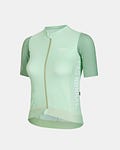
Sage, lavender, etc.
Sage, lavender, salmon, coral or sand have been well-received. Their roots in nature, in which one locates calm and refuge, are ironcast. And yet has the color palette proven very versatile across media, products, and identities, which is a function of its pastel otherworldliness. Fundamentally inclusive—we know how indiscriminately they’d all mingle in an oil spill—pastels now transpose the gentle warmth of beauty, where pastels have always dominated, to more primal, less polluted forms of self-care as well. Natural pastels encourage exercises in mental health and well-being, where they divest from very non-holistic beauty. And they invite an outdoors and lifestyle approach to sports, where they divest from plain gym-going. (Obviously, the result is not so much that the gym would be avoided, as it is that the spirit of nature, incarnated as pastel dress, mat, etc., joins us inside.) 1
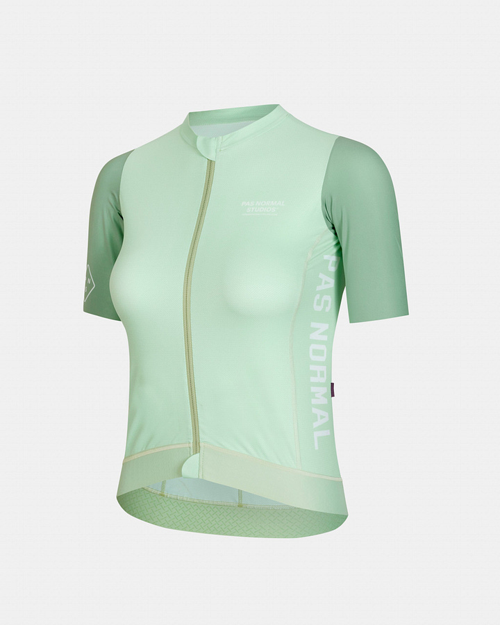
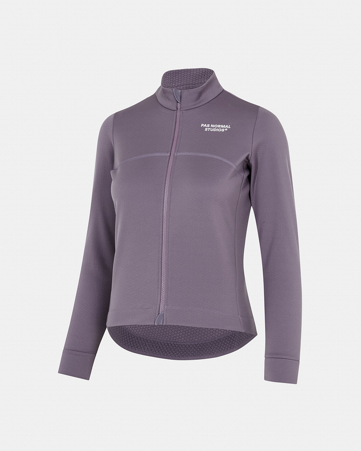
That said, one has had to be fairly apathetic towards worldly developments to still enjoy the intrinsic serenity of natural pastels. To even just the mildly present character, sage, lavender, and their relatives will have come to mean an astounding bluntness with which culture has been squeezing nature for its the healing potential.
Whereas natural pastels have lubricated the seasonal sales of most fashion, homeware, and other retailers, it is not coincidental that they have been especially prevalent across outdoor wear, as both attend to our same Romantic intuition. In fact, the synchronous success stories of outdoor wear and natural pastels are really one: Before outdoor wear could serve the modern inclination to reconnect with nature, its palette first had to be flipped on its head. High-visibility, premised on my contrast to natural backdrops, needed to make space for natural tones, which have me side with nature. The motor for the lifestylification of outdoor wear has been the natural paint bucket, finished off with some pastel bleach which sterilises, smartens, “defuses”—natural pastels are dew-coated grasslands and pale winter skies, not bug-ridden deadwood—, swapping some referential explicitness for greater presentability and versatility.
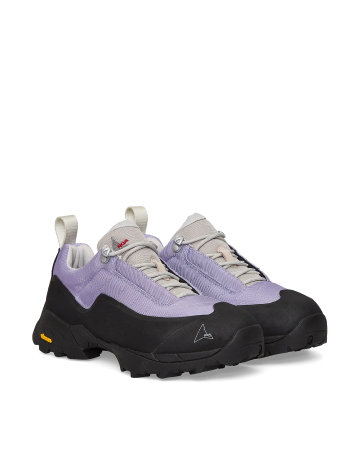
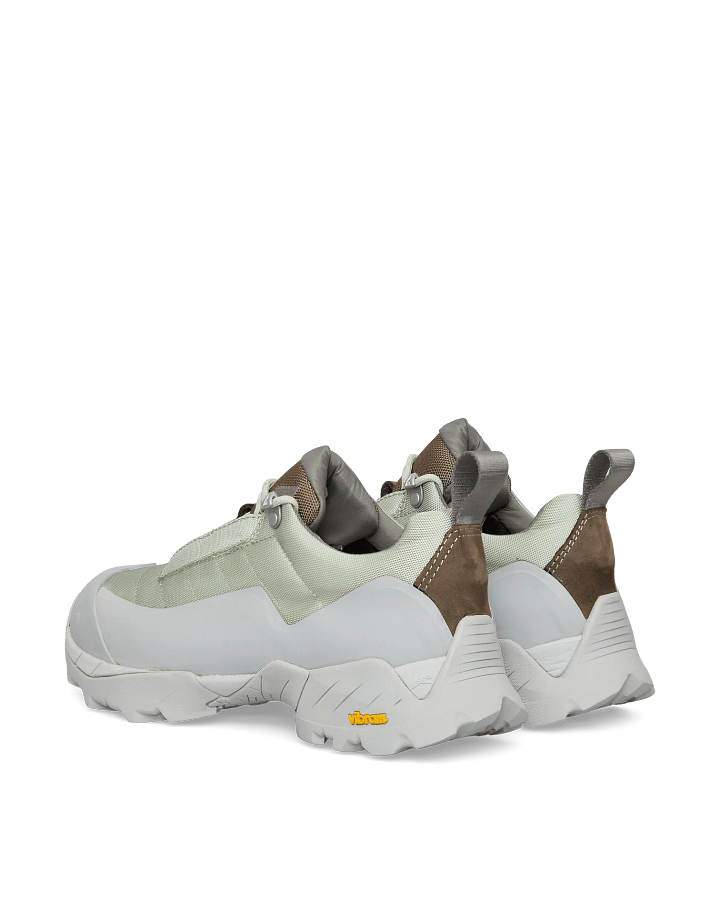
As an effect, the place of outdoor gear’s initial objective, the accessibility of outdoors, was taken by the exclusivity of the outdoors lifestyle. Celebrated outdoor brands derive their image from the simple application of natural pastels to items which are functionally average, although usually produced under above-average labour conditions. The hiking shoes from Italian ROA or cycling apparel from Danish Pas Normal both claim preclusive referral fees for coupling nature’s symbolic resources with culture’s time-specific gaps.
A macro-context in which the authentic and calm colours of nature presented themselves as solvents to polluted, restless culture, is meaningless against a micro-context in which culture has adopted these tones. Would pastel’s duplicitous position clash with their intrinsic qualities, then I could still personally weigh the timeless over the contextual. But instead, it outright corrupts them: I see nothing positive in pastels any longer, which come across as essentially glaring and irritating.
Skipping the expectable “honourable mentions” that could further substantiate these negative feelings—how once brought into life, things become the only way of satisfying a given need; how they may have created that need in the first place; how exclusionary this is; etc.—I would instead briefly like to introduce two more rarefied connotations. The first is the parallel between the extraction of natural resources (the gold mine, oil field, etc.) and today’s extraction of symbolic natural resources with arguably similar aims. And two, whereas one has grown weary of the platitude that Romanticism has been propelled by the early Industrial era, it is perhaps less commonly acknowledged that the same holds true conversely, so that the artistic instalment of something not only compensates for, but also contributes to its worldly clearance. Just like American poetry in the nineteenth-century, which mimicked Indian life and language, legitimised settlers’ concurrent eradication of those actual lives whose “spirit” it preserved,2 also today’s symbolic “erection” of nature concurs with an actual destruction it may inadvertantly sanction. If my pastel Gore-Tex signifies my loyalty with nature, do I still need to engage politically as well? Or worry about Gore-Tex being based on fluorinated polymers and virgin plastics?
If the colours of nature no longer read as true and authentic, but as false and deceiving, the question is what comes next. The evolution of “authentic"—from normcore, athleisure, and techwear (the simple, 2012-20), to pastel outdoor wear (the natural, 2020-23), to that which succeeds both, might be illustrated by the design journey of Canadian norda (see rows 1-3 below). Their trail running shoe 001 launched three years ago in white and black iterations, which not functionally, but aesthetically still placed norda within the then-authentic simple. Then in a collaboration last July, luxury label Satisfy tinted the 001 in limited-edition jadeite. Also in the last year or so, norda have expanded their natural portfolio with lilac, gravel (an array of sand, tan and coral), and labrador tea (a bleached moss, contrasted with the sole’s warm rubber like the jadeite). And now for 2023, the outlook is an electric blue, a metallic silver, and an artificial admixture of tar-steel-vanilla.
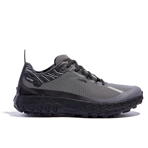
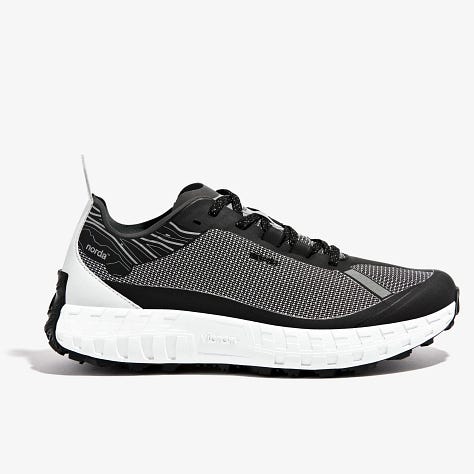
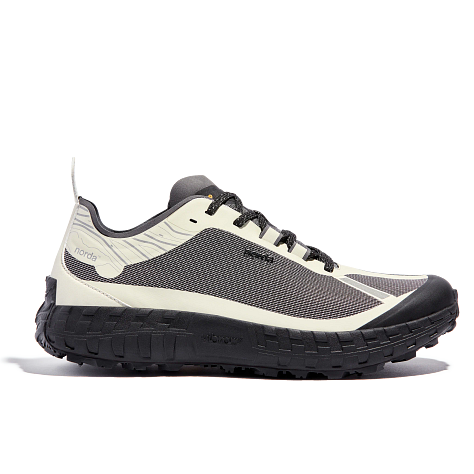
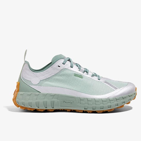
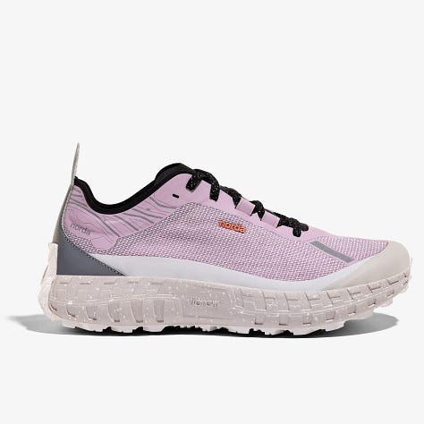
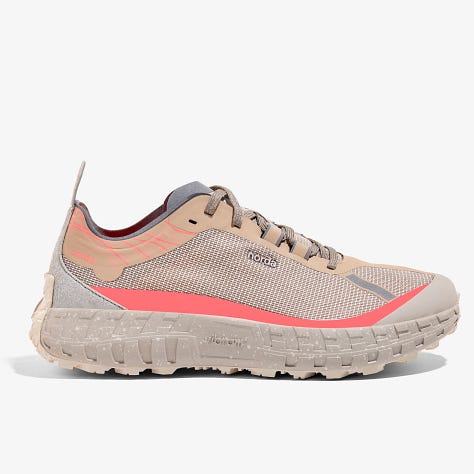
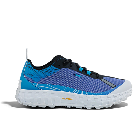
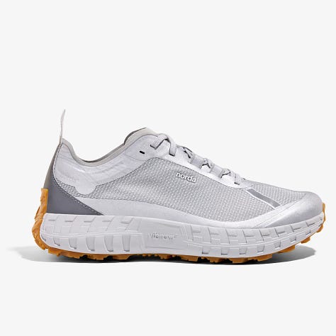
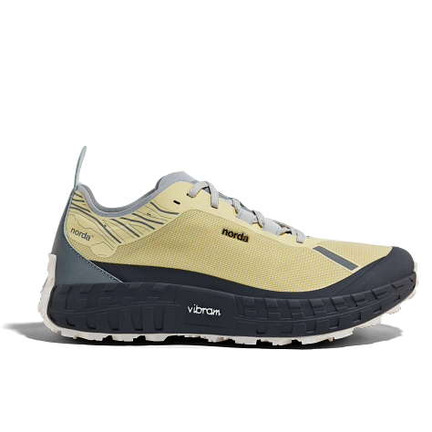
One starts to realise that our relation to nature is irreparable, and any attempt at reconciliation inauthentic. If this is so, the subsequent authentic would once again look industrial and electric. Chrome, deep blue, sonorous purple would also mean the comeback of sights missed by those familiar, and much-romanticised by those born too late: the disco ball from below, ultraviolet and duotone faces up close. Quite the opposite of natural calm, urban and late-night proximity is the next “intactness” to be restored—one lure being color.
When Digital Lavender has been named WGSN‘s Color of the Year 2023, then this has been for the same good reasons that are behind our weakness for other natural pastels as well, which are all wired the same.
Philip J. Deloria, Playing Indian (1998)


